Bangladesh scientists publish GIS analysis of COVID contagion-Methods can be applied to Australia and can help reduce lockdown costs , but Australian governments refuse to do so
by Ganesh Sahathevan
Scientists from Bangladesh have published a GIS analysis of COVID contagion in their country, proving yet again how useful and efficient GIS methods can be in crafting policies to deal with the contagion.They have concluded:
Findings and discussions from this research offer a better insight into the COVID-19 situation, which helped discuss policy implications to negotiate the future epidemic crisis. The primary policy response would be to decentralize the urban population and economic activities from and around the capital city, Dhaka to create self-sufficient regions throughout the country, especially in the north-western region.
While their findings are based on data from Bangladesh, their methods can be applied to Australia and can help reduce lockdown costs , but Australian governments refuse to do so. As explained previously on this blog:
Kerala is using low cost mapping methods to manage the spread of Wuhan Virus-NSW has access to the premium version of the same technology, but refuses to use it, choosing instead statewide lockdowns that have destroyed the economy
by Ganesh Sahathevan
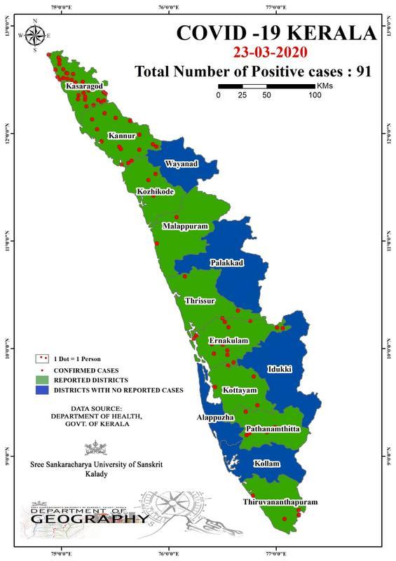
Kerala State in India is using low cost mapping methods to predict the spread of Wuhan Virus and isolate the hotspots.
Doing so will allow Kerala to isolate the hotspots and quarantine persons in those areas.
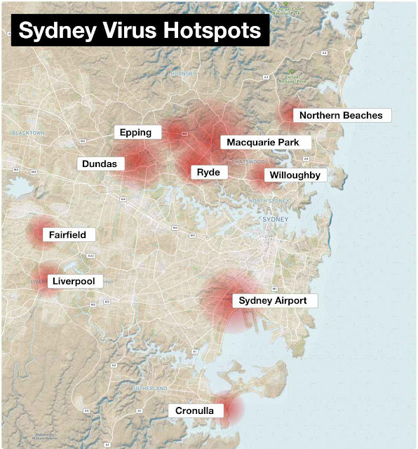
In NSW ,Australia, on the other hand, Premier Gladys Berejiklian has access to the premium version of the same mapping (or Geographical Information Systems ) technology, but refuses to use it, choosing instead to destroy her state's economy.
This is strange, for the hotspots within the state were known as early as a month ago (see map above and link). Computing the spread of the virus from the hotspots would have been easy as computing the effects of quarantining persons in the areas concerned. Instead, the Premier has chosen to restrict movement in every part of the state, deliberately causing the economy to collapse.
END
END
To BE READ WITH
Printed from
KOCHI: A group of research scholars in the department of Geography at Sree Sankaracharya University of Sanskrit, Kalady, is using geographic information system (GIS) to indicate the spatial distribution in increase/decrease of persons under Covid-19 observation in Kerala.
The teachers and researchers are using sophisticated software in the department laboratory to maps of Kerala showing the spread of Covid-19 in all 14 districts using data provided by the health department. The research team said that interpretations from the maps, which gives easily comprehensible facts of the virus spread, can be used to develop holistic approaches in formulating preventive measures in the state for the coming weeks.
 The map prepared by the university students
“We have started creating maps using QGIS software with the help of data from the website of directorate of health service and also the Facebook pages of district collectors. We started making the maps from March 12. It will be easily comprehended by anyone as it shows the number of persons in hospital isolation ward, home quarantine, new cases, positive case, etc, with the help of color-coding. As part of our social responsibility, we thought it will be helpful for all to understand the spread better,” said Sajilesh K, a research scholar at the varsity.
They said that the maps reflect the global process of the spread of the pandemic in the same order starting from China, Europe, America and the Middle East. “The first case was reported in Kerala after students from Wuhan came here. When the virus spread in Europe, mainly Italy, we reported cases in Pathanamthitta and Kottayam as these areas are home to many Keralites in Italy and other European countries. There were fewer cases then in north Kerala at that time. But now, with more cases being reported in the Middle East, the situation in north Kerala, which has more people working in the Gulf, has become grim. The trend shows that the spread is now towards north Kerala,” said Sajilesh
At present, three research scholars are working on the project and the department is planning to increase the number of research scholars in the coming weeks. But, with the varsity and labs shut down it is challenge for them.
“We are planning to bring out a map on how the disease spread in each district in the coming days by marking it according to various local bodies,” said Dr T S Saju, head, department of geography, Sree Sankaracharya University of Sanskrit, Kalady.
Kerala State in India is using low cost mapping methods to predict the spread of Wuhan Virus and isolate the hotspots.
Doing so will allow Kerala to isolate the hotspots and quarantine persons in those areas.
In NSW ,Australia, on the other hand, Premier Gladys Berejiklian has access to the premium version of the same mapping (or Geographical Information Systems ) technology, but refuses to use it, choosing instead to destroy her state's economy.
This is strange, for the hotspots within the state were known as early as a month ago (see map above and link). Computing the spread of the virus from the hotspots would have been easy as computing the effects of quarantining persons in the areas concerned. Instead, the Premier has chosen to restrict movement in every part of the state, deliberately causing the economy to collapse.
END
END
To BE READ WITH
Printed from
Kerala: GIS maps to study Covid-19
spread
TNN | Mar 25, 2020, 04.36 AM IST
KOCHI: A group of research scholars in the department of Geography at Sree Sankaracharya University of Sanskrit, Kalady, is using geographic information system (GIS) to indicate the spatial distribution in increase/decrease of persons under Covid-19 observation in Kerala.
The teachers and researchers are using sophisticated software in the department laboratory to maps of Kerala showing the spread of Covid-19 in all 14 districts using data provided by the health department. The research team said that interpretations from the maps, which gives easily comprehensible facts of the virus spread, can be used to develop holistic approaches in formulating preventive measures in the state for the coming weeks.

“We have started creating maps using QGIS software with the help of data from the website of directorate of health service and also the Facebook pages of district collectors. We started making the maps from March 12. It will be easily comprehended by anyone as it shows the number of persons in hospital isolation ward, home quarantine, new cases, positive case, etc, with the help of color-coding. As part of our social responsibility, we thought it will be helpful for all to understand the spread better,” said Sajilesh K, a research scholar at the varsity.
They said that the maps reflect the global process of the spread of the pandemic in the same order starting from China, Europe, America and the Middle East. “The first case was reported in Kerala after students from Wuhan came here. When the virus spread in Europe, mainly Italy, we reported cases in Pathanamthitta and Kottayam as these areas are home to many Keralites in Italy and other European countries. There were fewer cases then in north Kerala at that time. But now, with more cases being reported in the Middle East, the situation in north Kerala, which has more people working in the Gulf, has become grim. The trend shows that the spread is now towards north Kerala,” said Sajilesh
At present, three research scholars are working on the project and the department is planning to increase the number of research scholars in the coming weeks. But, with the varsity and labs shut down it is challenge for them.
“We are planning to bring out a map on how the disease spread in each district in the coming days by marking it according to various local bodies,” said Dr T S Saju, head, department of geography, Sree Sankaracharya University of Sanskrit, Kalady.


